

Top
logo Learning Spot
Menu

Chapter 5 Connecting the Dots... (Class 7 - Latest Maths NCERT (Ganita Prakash II) Solutions)

Searching for the most accurate NCERT Solutions for Chapter 5: Connecting the Dots...? This page offers clear, detailed answers and step-by-step explanations for the latest Class 7 Maths curriculum. We guide you through the world of Statistics, helping you solve exercises that distinguish between simple facts and Statistical Questions. Whether you are analyzing variability in data or predicting performance patterns, our solutions provide the logical framework needed to interpret information effectively.

Our solutions focus on mastering Representative Values, including the Arithmetic Mean and the Median. We provide comprehensive breakdowns on how to identify and account for Outliers—those extreme values that can shift the mean. Drawing from the Ganita Prakash II textbook, we also explain the historical context of Samamiti and Samīkaraṇa, ensuring you understand the balancing act required in mathematical reasoning and data organization.

To help you excel in data visualization, this page includes solved examples for Dot Plots and Clustered (Double) Column Graphs. From comparing onion prices to analyzing global rocket launches and daylight variations, our walkthroughs make complex graph interpretation simple. These resources, curated by learningspot.co, are designed to help you master the role of a "Data Detective" and achieve excellence in your CBSE examinations.

Content On This Page
Figure It Out (Page No. 101) Figure It Out (Page No. 112 - 113) Figure It Out (Page No. 122 - 125)
Figure It Out (Page No. 129 - 134)


Figure It Out (Page No. 101)

Question 1. Shreyas is playing with a bat and a ball — but not cricket. He counts the number of times he can bounce the ball on the bat before it falls to the ground. The data for $8$ attempts is $6, 2, 9, 5, 4, 6, 3, 5$. Calculate the average number of bounces of the ball that Shreyas is able to make with his bat.

Answer:

Given:

Number of bounces recorded in $8$ attempts: $6, 2, 9, 5, 4, 6, 3, 5$

Total number of attempts = $8$


To Find:

The average number of bounces.


Solution:

To find the average, we use the formula for Arithmetic Mean:

$\text{Average} = \frac{\text{Sum of all observations}}{\text{Total number of observations}}$

(Formula)

First, we calculate the sum of the number of bounces:

$\text{Sum} = 6 + 2 + 9 + 5 + 4 + 6 + 3 + 5$

$\text{Sum} = 40$


Now, we divide the sum by the total number of attempts:

$\text{Average} = \frac{40}{8}$

$\text{Average} = \frac{\cancel{40}^{5}}{\cancel{8}_{1}}$

$\text{Average} = 5$


The average number of bounces Shreyas is able to make with his bat is $5$.

Question 2. Try the activity above on your own.

Collect data for $7$ or more attempts and find the average.

Answer:

Activity: Perform the ball-bouncing activity and record the results for at least $7$ attempts.


Sample Data:

Let us assume the data collected for $7$ attempts is as follows:

Attempt Number Number of Bounces (x)
112
28
315
410
57
614
711

Solution for Sample Data:

Given:

Observations: $12, 8, 15, 10, 7, 14, 11$

Number of attempts = $7$

To Find:

The average of the sample data.


Calculation of Sum:

$\text{Sum} = 12 + 8 + 15 + 10 + 7 + 14 + 11$

$\text{Sum} = 77$

Calculation of Average:

$\text{Average} = \frac{77}{7}$

$\text{Average} = \frac{\cancel{77}^{11}}{\cancel{7}_{1}}$

$\text{Average} = 11$


For the sample activity data, the average number of bounces is $11$.

Note: You should record your own actual bounces in a similar table and calculate your personal average using the same method.

Question 3. Identify a flowering plant in your neighbourhood. Track the number of flowers that bloom every day over a week during its flowering season. What is the average number of flowers that bloomed per day?

Answer:

This is a practical activity. Below is a sample observation of a Hibiscus plant in an Indian garden recorded over one week.


Given:

The number of flowers blooming each day for $7$ days is recorded in the table below:

Day Number of Flowers Bloomed ($x$)
Monday$4$
Tuesday$6$
Wednesday$3$
Thursday$5$
Friday$2$
Saturday$4$
Sunday$4$

To Find:

Average number of flowers bloomed per day.


Solution:

The average is calculated as the sum of all flowers divided by the total number of days.

$\text{Sum of flowers} = 4 + 6 + 3 + 5 + 2 + 4 + 4$

$\text{Sum of flowers} = 28$

(Total over $7$ days)

Now, applying the average formula:

$\text{Average} = \frac{28}{7}$

$\text{Average} = \frac{\cancel{28}^{4}}{\cancel{7}_{1}}$

$\text{Average} = 4$


In this sample observation, the average number of flowers that bloomed per day is $4$.

Question 4. Two friends are training to run a $100\text{ m}$ race. Their running times over the past week are given in seconds — Nikhil: $17, 18, 17, 16, 19, 17, 18$; Sunil: $20, 18, 18, 17, 16, 16, 17$. Who on average ran quicker?

Answer:

Given:

Nikhil's times (in seconds): $17, 18, 17, 16, 19, 17, 18$

Sunil's times (in seconds): $20, 18, 18, 17, 16, 16, 17$

Total number of days for each = $7$


To Find:

Who is quicker on average (the person with the lower average time is quicker).


Solution:

Step 1: Calculate Nikhil's Average Time

$\text{Sum for Nikhil} = 17 + 18 + 17 + 16 + 19 + 17 + 18$

$\text{Sum for Nikhil} = 122 \text{ seconds}$

$\text{Average}_{\text{Nikhil}} = \frac{122}{7}$

$\text{Average}_{\text{Nikhil}} \approx 17.43 \text{ seconds}$


Step 2: Calculate Sunil's Average Time

$\text{Sum for Sunil} = 20 + 18 + 18 + 17 + 16 + 16 + 17$

$\text{Sum for Sunil} = 122 \text{ seconds}$

$\text{Average}_{\text{Sunil}} = \frac{122}{7}$

$\text{Average}_{\text{Sunil}} \approx 17.43 \text{ seconds}$


Comparison:

Comparing the average times of both friends:

$\text{Average}_{\text{Nikhil}} = \text{Average}_{\text{Sunil}}$

Since both Nikhil and Sunil have the same average time of approximately $17.43$ seconds, on average, both ran with the same speed. Neither was quicker than the other on average during this week.

Question 5. The enrolment in a school during six consecutive years was as follows: $1555, 1670, 1750, 2013, 2040, 2126$. Find the mean enrolment in the school during this period.

Answer:

Given:

Enrolment data for $6$ years: $1555, 1670, 1750, 2013, 2040, 2126$

Total number of years = $6$


To Find:

Mean (Average) enrolment.


Solution:

We calculate the mean using the formula:

$\text{Mean} = \frac{\text{Sum of all enrolments}}{\text{Number of years}}$

First, find the sum of all enrolments:

$\text{Sum} = 1555 + 1670 + 1750 + 2013 + 2040 + 2126$

$\text{Sum} = 11154$


Now, divide the total sum by the number of years:

$\text{Mean} = \frac{11154}{6}$

$\text{Mean} = \frac{\cancel{11154}^{1859}}{\cancel{6}_{1}}$

$\text{Mean} = 1859$


The mean enrolment of the school during this six-year period is $1859$ students.


Figure It Out (Page No. 112 - 113)

The table shows the monthly price of onions, in rupees per kilogram (kg), at two towns.

Month Yahapur Price ($\textsf{₹}$) Wahapur Price ($\textsf{₹}$)
January2519
February2417
March2623
April2830
May3038
June3535
July3942
August4339
September4953
October5660
November5952
December4442

Question 1. Find the median of onion prices in Yahapur and Wahapur.

Answer:

Given:

The monthly onion prices for two locations, Yahapur and Wahapur, for 12 months.

Yahapur prices: $\{25, 24, 26, 28, 30, 35, 39, 43, 49, 56, 59, 44\}$

Wahapur prices: $\{19, 17, 23, 30, 38, 35, 42, 39, 53, 60, 52, 42\}$


To Find:

The Median price for both Yahapur and Wahapur.


Solution:

To find the median, we must first arrange the data in ascending order. Since the number of observations ($n$) is $12$ (which is an even number), the median will be the average of the $\left(\frac{n}{2}\right)^{th}$ and $\left(\frac{n}{2} + 1\right)^{th}$ terms.

$\text{Median} = \frac{6^{th} \text{ term} + 7^{th} \text{ term}}{2}$

[For $n = 12$]


1. Calculating Median for Yahapur:

Arranging Yahapur prices in ascending order:

$24, 25, 26, 28, 30, \mathbf{35}, \mathbf{39}, 43, 44, 49, 56, 59$

Here, the $6^{th}$ term is $35$ and the $7^{th}$ term is $39$.

$\text{Median (Yahapur)} = \frac{35 + 39}{2}$

$\text{Median} = \frac{74}{2} = 37$

The median price in Yahapur is $\textsf{₹} 37$.


2. Calculating Median for Wahapur:

Arranging Wahapur prices in ascending order:

$17, 19, 23, 30, 35, \mathbf{38}, \mathbf{39}, 42, 42, 52, 53, 60$

Here, the $6^{th}$ term is $38$ and the $7^{th}$ term is $39$.

$\text{Median (Wahapur)} = \frac{38 + 39}{2}$

$\text{Median} = \frac{77}{2} = 38.5$

The median price in Wahapur is $\textsf{₹} 38.5$.


Final Answer:

The median price for Yahapur is $\textsf{₹} 37$ and the median price for Wahapur is $\textsf{₹} 38.5$.

Question 2. Sanskruti asked her class how many domestic animals and pets each had at home. Some of the students were absent.

The data values are: $0, 1, 0, 4, 8, 0, $$ 0, 2, 1, 1, 5, $$ 3, 4, 0, 0, \text{—}, 10, $$ 25, 2, \text{—}, 2, 4$.

Find the mean and median. How would you describe this data?

Answer:

Given:

Data values (excluding missing values "—"): $0, 1, 0, 4, 8, 0, 0, 2, 1, 1, 5, 3, 4, 0, 0, 10, 25, 2, 2, 4$

Total number of observations ($n$) = $20$


To Find:

1. Mean, 2. Median, 3. Description of data.


Solution:

1. Calculating the Mean:

$\text{Sum} = 0 + 1 + 0 + 4 + 8 + 0 + 0 + 2 + 1 + 1 + 5 + 3 + 4 + 0 + 0 $$ + 10 + 25 + 2 + 2 + 4$

$\text{Sum} = 72$

$\text{Mean} = \frac{72}{20}$

$\text{Mean} = \frac{\cancel{72}^{3.6}}{\cancel{20}_{1}}$

$\text{Mean} = 3.6$


2. Calculating the Median:

First, we arrange the $20$ observations in ascending order:

$0, 0, 0, 0, 0, 0, 1, 1, 1, 2, 2, 2, 3, 4, 4, 4, 5, 8, 10, 25$

For $n = 20$ (even), the median is the average of the $10^{th}$ and $11^{th}$ terms.

$10^{th} \text{ term} = 2$

$11^{th} \text{ term} = 2$

$\text{Median} = \frac{2 + 2}{2} = 2$


Description:

The mean ($3.6$) is higher than the median ($2$) because of the outlier $25$. Most students have $0$ to $2$ pets, but a few high values pull the average up. The data is skewed to the right.

Question 3. Rintu takes care of a date-palm tree farm in Habra. The heights of the trees (in feet) in his farm are given as: $50, 45, 43, 52, 61, 63, $$ 46, 55, 60, 55, 59, 56, $$ 56, 49, 54, 65, 66, $$ 51, 44, 58, 60, 54, 52, $$ 57, 61, 62, $$ 60, 60, $$ 67$.

Fill the dot plot, and mark the mean and median. How would you describe the heights of these palm trees? Can you think of quicker ways to find the mean? How many trees are shorter than the average height?

Empty dot plot for palm tree heights

Answer:

Given:

Heights (in feet): $50, 45, 43, 52, 61, 63, 46, 55, 60, 55, 59, 56, $$ 56, 49, 54, $$ 65, 66, 51, 44, 58, 60, 54, 52, 57, 61, 62, 60, 60, 67$

Total number of trees = $29$


To Find:

1. Dot plot, 2. Mean, 3. Median, 4. Trees shorter than average.


Solution:

1. Dot Plot:

To fill the dot plot, place a dot for every occurrence of a height on the number line provided in the question. For example, place $4$ dots vertically above the number $60$.


Palm tree farm dot plot visualization

2. Calculating the Mean:

$\text{Sum of heights} = 1621$

$\text{Mean} = \frac{1621}{29} \approx 55.89 \text{ feet}$

Quicker way: A quicker way to find the mean is to use an assumed mean (like $55$) and calculate deviations, or group the heights by frequency before multiplying.


3. Calculating the Median:

Arrange the $29$ heights in ascending order:

$43, 44, 45, 46, 49, 50, 51, 52, 52, 54, 54, 55, 55, 56, \mathbf{56}, 57, 58, 59, 60, $$ 60, 60, 60, 61, 61, 62, 63, 65, 66, 67$

The median is the $(\frac{29+1}{2})^{th} = 15^{th}$ term.

$\text{Median} = 56 \text{ feet}$


4. Trees shorter than the average height:

The average height is approximately $55.89$ feet. We count how many trees have heights less than $55.89$ feet:

Heights: $43, 44, 45, 46, 49, 50, 51, 52, 52, 54, 54, 55, 55$

Total count = $13$ trees.

Question 4. The daily water usage from a tap was measured. The usage in liters for the first few days are: $5.6, 8, 3.09, 12.9, 6.5, 12.1, 11.3, 20.5, 7.4$.

(a) Can the mean or median daily usage lie between $25$ and $30$? Justify your claim using the meaning of mean and median.

(b) Can the mean or median be lesser than the minimum value or greater than the maximum value in a data?

Answer:

Given:

Daily water usage (in liters): $5.6, 8, 3.09, 12.9, 6.5, 12.1, 11.3, 20.5, 7.4$

Number of days ($n$) = $9$


Solution (a):

To determine if the mean or median can lie between $25$ and $30$, let us look at the range of the data.

Minimum value = $3.09$

Maximum value = $20.5$

The Mean (average) represents the central value of the data. Since all observations are less than or equal to $20.5$, their average cannot be greater than the largest value. Similarly, the Median is the middle value when the data is arranged in order ($3.09, 5.6, 6.5, 7.4, 8, 11.3, 12.1, 12.9, 20.5$). The median here is $8$.

Therefore, No, the mean or median cannot lie between $25$ and $30$ because both must lie within the range of the actual data collected (i.e., between $3.09$ and $20.5$).


Solution (b):

No, the mean or median can never be lesser than the minimum value or greater than the maximum value of the data set.

The mean and median are measures of central tendency. They always fall somewhere within the boundaries of the smallest and largest values in the data set.

Question 5. The weights of a few newborn babies are given in kgs. Fill the dot plot provided below. Analyse and compare this data.

Boys $3.5$ $4.1$ $2.6$ $3.2$ $3.4$ $3.8$
Girls $4.0$ $3.1$ $3.4$ $3.7$ $2.5$ $3.4$
Empty dot plot for newborn weights

Answer:

Given:

Weights of Boys ($6$ babies): $3.5, 4.1, 2.6, 3.2, 3.4, 3.8$

Weights of Girls ($6$ babies): $4.0, 3.1, 3.4, 3.7, 2.5, 3.4$


To Find:

1. Fill the dot plot, 2. Calculate Mean and Median for both groups, 3. Analyse and compare the data.


Filled dot plot for baby weights

Solution:

Step 1: Analysis of Boys' Weights

Arranging weights of boys in ascending order: $2.6, 3.2, 3.4, 3.5, 3.8, 4.1$

$\text{Sum for boys} = 2.6 + 3.2 + 3.4 + 3.5 + 3.8 + 4.1 = 20.6 \text{ kg}$

$\text{Mean weight of boys} = \frac{20.6}{6} \approx 3.43 \text{ kg}$

Since the number of observations is $6$ (even), the median is the average of the $3^{rd}$ and $4^{th}$ terms ($3.4$ and $3.5$):

$\text{Median weight of boys} = \frac{3.4 + 3.5}{2} = 3.45 \text{ kg}$


Step 2: Analysis of Girls' Weights

Arranging weights of girls in ascending order: $2.5, 3.1, 3.4, 3.4, 3.7, 4.0$

$\text{Sum for girls} = 4.0 + 3.1 + 3.4 + 3.7 + 2.5 + 3.4 = 20.1 \text{ kg}$

$\text{Mean weight of girls} = \frac{20.1}{6} = 3.35 \text{ kg}$

The middle terms are both $3.4$ ($3^{rd}$ and $4^{th}$ terms):

$\text{Median weight of girls} = \frac{3.4 + 3.4}{2} = 3.4 \text{ kg}$


Step 3: Dot Plot and Comparison

The dot plot is filled by placing dots at the respective positions for each value. Note that $3.4$ will have three dots (one from boys and two from girls).

Comparison Table:

Category Mean Weight Median Weight
Boys$3.43 \text{ kg}$$3.45 \text{ kg}$
Girls$3.35 \text{ kg}$$3.40 \text{ kg}$

Conclusion:

Based on the analysis, we observe that the mean weight of boys ($3.43 \text{ kg}$) is slightly higher than the mean weight of girls ($3.35 \text{ kg}$). Similarly, the median weight for boys is also higher. This indicates that, in this specific sample, the newborn boys are generally slightly heavier than the newborn girls.

Question 6. The dot plots of heights of another section of Grade 5 students of the same school are shown below. Can you share your observations? What can we infer from the dot plots and the central tendency measures?

Whole class: Mean $= 141.21$, Median $= 142.5$

Boys: Mean $= 142.05$, Median $= 143$

Girls: Mean $= 140.14$, Median $= 140$
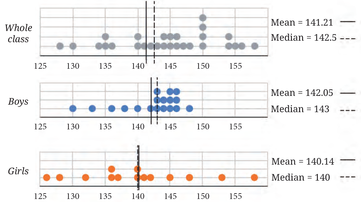
Dot plots comparing heights of boys, girls, and whole class

Compare the heights of the two sections. Share your observations.

Answer:

Given:

Whole class: Mean $= 141.21 \text{ cm}$, Median $= 142.5 \text{ cm}$

Boys: Mean $= 142.05 \text{ cm}$, Median $= 143 \text{ cm}$

Girls: Mean $= 140.14 \text{ cm}$, Median $= 140 \text{ cm}$


Observations:

1. Comparison of Boys and Girls: The average height of boys ($142.05 \text{ cm}$) is higher than that of girls ($140.14 \text{ cm}$). Similarly, the median height for boys ($143 \text{ cm}$) is greater than that of girls ($140 \text{ cm}$).

2. Distribution in Dot Plots: The dot plot for boys shows that most of the data points are clustered between $142 \text{ cm}$ and $146 \text{ cm}$. In contrast, the dot plot for girls shows a wider spread of heights, ranging from $126 \text{ cm}$ to $158 \text{ cm}$.

3. Central Tendency: For the whole class and the boys' group, the median is slightly higher than the mean, which suggests that the data is slightly negatively skewed (more students have heights on the higher side). For girls, the mean and median are very close, indicating a more symmetrical distribution.


Inference:

From the dot plots and central tendency measures, we can infer that boys in this section are generally taller than girls. While the girls have some individuals who are very tall ($158 \text{ cm}$) or very short ($126 \text{ cm}$), the boys' heights are more consistently grouped around the $142$–$146 \text{ cm}$ range. The whole class average is balanced by the combination of these two groups.

Question 7. The weights of some sumo wrestlers and ballet dancers are:

Sumo wrestlers: $295.2\text{ kg}, 250.7\text{ kg}, 234.1\text{ kg}, 221.0\text{ kg}, 200.9\text{ kg}$.

Ballet dancers: $40.3\text{ kg}, 37.6\text{ kg}, 38.8\text{ kg}, 45.5\text{ kg}, 44.1\text{ kg}, 48.2\text{ kg}$.

Approximately how many times heavier is a sumo wrestler compared to a ballet dancer?

Answer:

Given:

Weights of Sumo wrestlers: $295.2, 250.7, 234.1, 221.0, 200.9$ (in kg)

Weights of Ballet dancers: $40.3, 37.6, 38.8, 45.5, 44.1, 48.2$ (in kg)


To Find:

How many times heavier a sumo wrestler is compared to a ballet dancer on average.


Solution:

Step 1: Calculate the mean weight of Sumo wrestlers

Total sum of weights $= 295.2 + 250.7 + 234.1 + 221.0 + 200.9 $$ = 1201.9 \text{ kg}$

Number of wrestlers $= 5$

$\text{Mean weight of Sumo wrestlers} = \frac{1201.9}{5} = 240.38 \text{ kg}$


Step 2: Calculate the mean weight of Ballet dancers

Total sum of weights $= 40.3 + 37.6 + 38.8 + 45.5 + 44.1 + 48.2 $$ = 254.5 \text{ kg}$

Number of dancers $= 6$

$\text{Mean weight of Ballet dancers} = \frac{254.5}{6} \approx 42.42 \text{ kg}$


Step 3: Comparison

To find how many times heavier a sumo wrestler is, we divide the average weight of a sumo wrestler by the average weight of a ballet dancer:

$\text{Ratio} = \frac{240.38}{42.42} \approx 5.66$


Rounding to the nearest whole number, we find that a sumo wrestler is approximately $6$ times heavier than a ballet dancer.


Figure It Out (Page No. 122 - 125)

Question 1. The following infographic shows the speeds of a few animals in air, on land, and in water. Can we call this graph a bar graph?
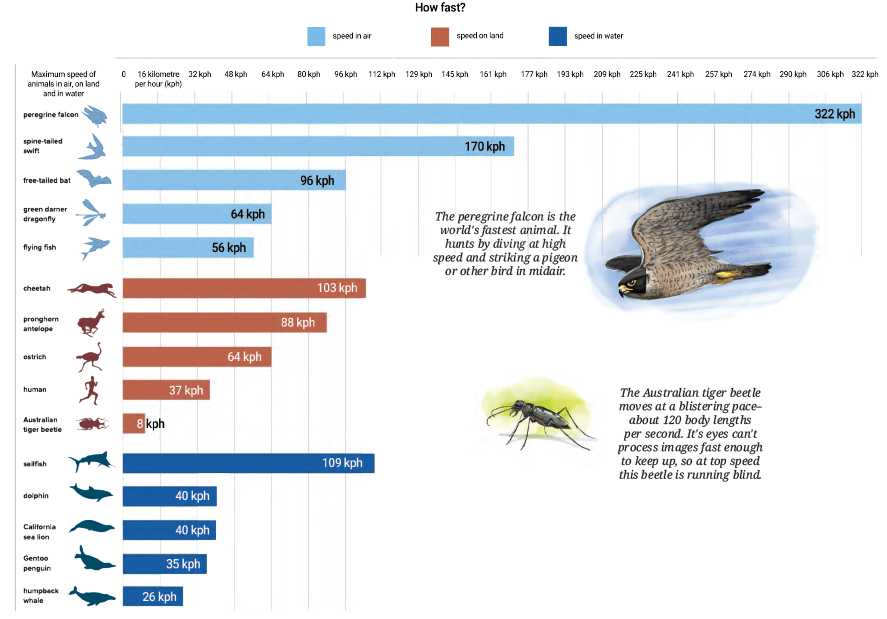
Infographic showing speeds of various animals in different environments

The peregrine falcon is the world's fastest animal. It hunts by diving at high speed and striking a pigeon or other bird in midair.

The Australian tiger beetle moves at a blistering pace—about $120$ body lengths per second. Its eyes can't process images fast enough to keep up, so at top speed this beetle is running blind.

(a) What is the scale used in this graph?

(b) What did you find interesting in this infographic? What do you want to explore further?

(c) Identify a pair of creatures where one’s speed is about twice that of the other.

(d) Can we say that a sailfish is about $4$ times faster than a humpback whale? Can we say that a sailfish is the fastest aquatic animal in the world?

Answer:

Yes, this infographic can be classified as a horizontal bar graph. In this graph, the length of each colored bar represents the maximum speed of a specific animal, allowing for an easy visual comparison between different species and environments (air, land, and water).


(a) Scale:

Looking at the horizontal axis, the markings increase in equal intervals of $16$.

The scale used in the graph is: $1$ unit length $= 16 \text{ km/h (kph)}$.


(b) Observations:

One of the most interesting facts in this infographic is about the Australian tiger beetle. Even though its absolute speed is low ($8 \text{ kph}$), it moves so fast relative to its body size ($120$ lengths per second) that its brain cannot process visual information, making it "run blind." I would like to explore how other small insects, like ants or bees, compare in terms of body lengths per second.


(c) Identifying Pairs:

We need to find two animals where $Speed_{A} \approx 2 \times Speed_{B}$.

1. Flying fish ($56 \text{ kph}$) and Sailfish ($109 \text{ kph}$): Since $56 \times 2 = 112$, the Sailfish is approximately twice as fast as the Flying fish.

2. Pronghorn antelope ($88 \text{ kph}$) and Spine-tailed swift ($170 \text{ kph}$): Since $88 \times 2 = 176$, the Spine-tailed swift is approximately twice as fast as the Pronghorn antelope.


(d) Aquatic Animal Comparison:

Speed of Sailfish $= 109 \text{ kph}$

Speed of Humpback whale $= 26 \text{ kph}$

Calculation: $26 \times 4 = 104$

Since $109$ is very close to $104$, yes, we can say that a sailfish is about $4$ times faster than a humpback whale.

Question 2. Preyashi asked her students ‘If you were to get a super power to become aquatic (water-borne), aerial (air-borne), or spaceborne which one would you choose?’. The responses are shown below. Some chose none. Draw a double-bar graph comparing how both grades chose each option. Choose an appropriate scale.

Grade 5 $w, a, a, a, w, n, s, a, n, w, a, a, a, a, a, w, w, s, a, a, n, w, a, a, n$
Grade 9 $n, w, s, a, s, w, s, s, a, a, w, s, s, a, s, a, n, w, s, s, a, w, a, w, a$

Answer:

To Find:

A double-bar graph comparing the superpower preferences of Grade 5 and Grade 9 students.


Step 1: Organizing Data (Frequency Count)

We count the occurrences for each category: Aerial ($a$), Aquatic ($w$), Spaceborne ($s$), and None ($n$).

Super Power Category Grade 5 (Count) Grade 9 (Count)
Aerial ($a$)$13$$8$
Aquatic ($w$)$6$$6$
Spaceborne ($s$)$2$$9$
None ($n$)$4$$2$
Total Responses $25$ $25$

Step 2: Representation on Graph

To construct the double-bar graph:

1. Scale: We can take $1 \text{ unit} = 2 \text{ students}$ on the vertical (Y) axis.

2. X-axis: Represent the four categories: Aerial, Aquatic, Spaceborne, and None.

3. Y-axis: Number of students, ranging from $0$ to $14$.

4. Bars: For each category, draw two side-by-side bars. Use different shading or colors (e.g., solid for Grade 5 and striped for Grade 9).


Double bar graph showing superpower preferences of Grade 5 and Grade 9

Question 3. The temperature variation over two days in different months in Jodhpur, Rajasthan, is given below. Draw a double-bar graph. Use the scale $1$ unit $= 4^\circ\text{C}$. Can you guess which two months these days might belong to?

$12\text{ am}$ $3\text{ am}$ $6\text{ am}$ $9\text{ am}$ $12\text{ pm}$ $3\text{ pm}$ $6\text{ pm}$ $9\text{ pm}$
Day 1 $20^\circ\text{C}$ $18^\circ\text{C}$ $16^\circ\text{C}$ $20^\circ\text{C}$ $26^\circ\text{C}$ $34^\circ\text{C}$ $30^\circ\text{C}$ $24^\circ\text{C}$
Day 2 $37^\circ\text{C}$ $34^\circ\text{C}$ $30^\circ\text{C}$ $33^\circ\text{C}$ $37^\circ\text{C}$ $43^\circ\text{C}$ $42^\circ\text{C}$ $39^\circ\text{C}$

Answer:

Given:

Temperature readings for Jodhpur at $8$ different time intervals for two separate days.

Scale required: $1 \text{ unit} = 4^\circ\text{C}$


To Find:

1. Double-bar graph representation.

2. Identification of the likely months for Day 1 and Day 2.


Solution:

To draw the double-bar graph, we represent the time intervals on the x-axis and the temperature on the y-axis.

For Day 1, the temperatures range from $16^\circ\text{C}$ to $34^\circ\text{C}$. For Day 2, the temperatures range from $30^\circ\text{C}$ to $43^\circ\text{C}$.

Graph Construction: On the y-axis, we mark points at intervals of $4$ ($0, 4, 8, 12, 16, \dots, 44$). For every time slot, two bars are drawn side-by-side: one for Day 1 and one for Day 2.


Double bar graph of temperature variation in Jodhpur

Month Identification:

Jodhpur is located in Rajasthan, which experiences extreme climatic variations.

1. Day 1: The temperatures are moderate, with a minimum of $16^\circ\text{C}$ and a maximum of $34^\circ\text{C}$. This indicates a transition period. It could likely be the month of February (end of winter) or November (beginning of winter).

2. Day 2: The temperatures are very high, with a minimum of $30^\circ\text{C}$ (even at night) and a peak of $43^\circ\text{C}$. This is characteristic of the peak summer season in Rajasthan. It most likely belongs to the month of May or June.

Question 4. The following clustered-bar graph shows the number of electric vehicles registered in some states every year from $2022$ to $2024$.
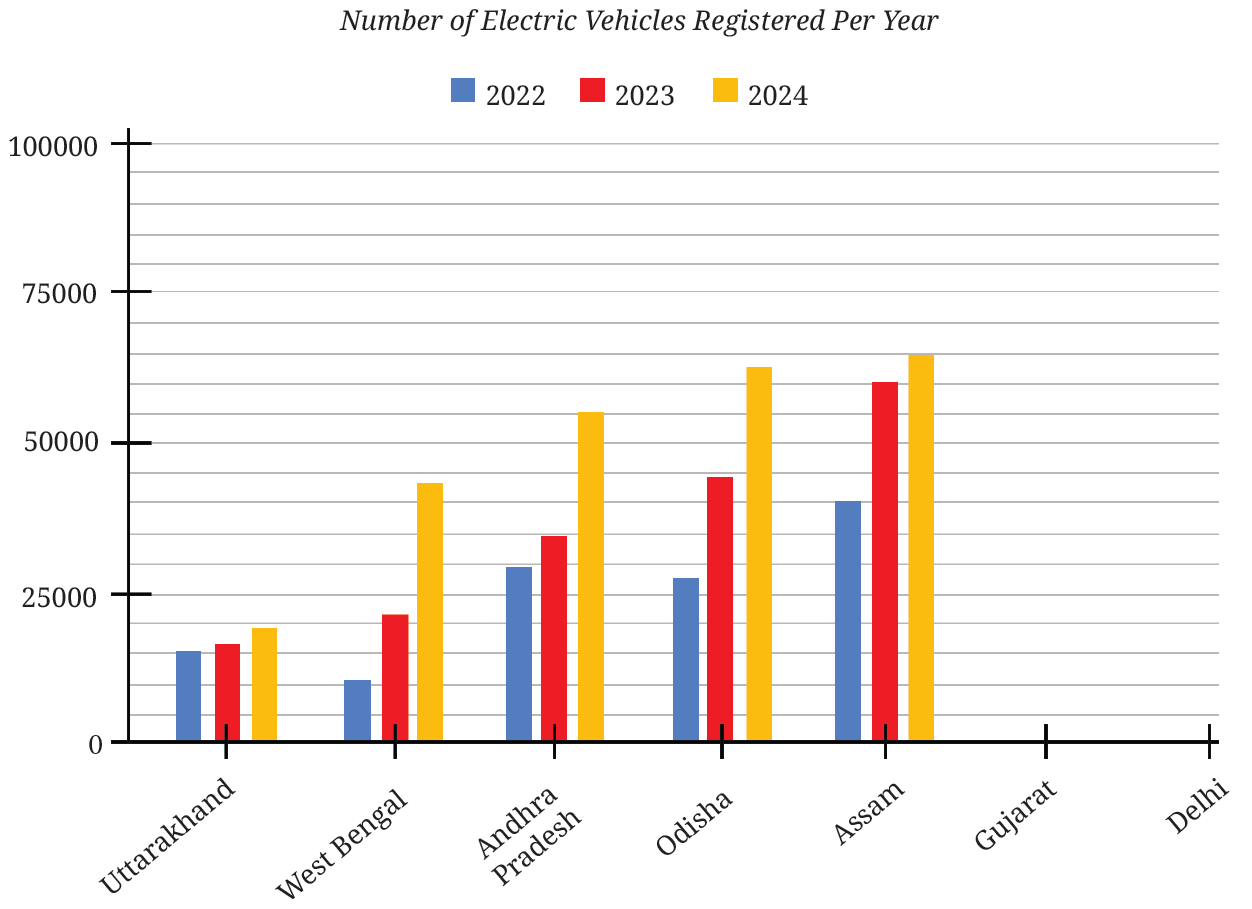
Clustered-bar graph of EV registrations from 2022 to 2024

(a) The data (rounded-off to thousands) for the states of Gujarat and Delhi are given in the table below. Mark the corresponding bars on the bar graph. (It is enough if you place the top of the bars between the two appropriate vertical guidelines.)

State $2022$ $2023$ $2024$
Gujarat $69000$ $89000$ $78000$
Delhi $62000$ $74000$ $81000$

(b) Notice how the graph is organised, what scale is used, and what patterns the data shows.

(c) How would you describe the change for various states between $2022$ and $2024$?

(d) Approximately how many more registrations did Assam get in $2023$ compared to $2022$?

(e) How many times more did the registrations in West Bengal increase from $2022$ to $2024$?

(f) Is this statement correct — ‘There were very few new registrations in Uttarakhand in $2023$ and $2024$, as the increase in the bar lengths is minimal’?

Answer:

(a) Marking the bars for Gujarat and Delhi:

To accurately mark the bars for part (a), we first determine the value of the grid lines on the y-axis.

$\text{Major interval on y-axis} = 25000$

(Given scale)

There are $5$ small horizontal grid lines between $0$ and $25000$. Thus, the value of each small grid line is:

$\text{Value of 1 small grid line} = \frac{25000}{5}$

[Calculation of scale units]

$\text{Value of 1 small grid line} = 5000$

Using this scale, we can calculate the heights for the bars of Gujarat and Delhi:

For Gujarat:

1. 2022 ($69000$): Since $70000$ is the $14^{th}$ small line ($14 \times 5000$), the bar for $2022$ should be drawn just slightly below the $14^{th}$ line.

2. 2023 ($89000$): Since $90000$ is the $18^{th}$ small line ($18 \times 5000$), the bar for $2023$ should be drawn just below the $18^{th}$ line.

3. 2024 ($78000$): This bar should be placed slightly above the $15^{th}$ line ($75000$) but below the $16^{th}$ line ($80000$).

For Delhi:

1. 2022 ($62000$): This bar should be drawn between the $12^{th}$ line ($60000$) and the $13^{th}$ line ($65000$).

2. 2023 ($74000$): This bar should end almost at the $15^{th}$ line ($75000$).

3. 2024 ($81000$): This bar should be drawn just above the $16^{th}$ line ($80000$).

Bar graph showing slots for Gujarat and Delhi

(b) Organisation, Scale, and Patterns:

Organisation: The graph is a clustered-bar graph where data for three years is grouped together for each state along the x-axis.

Scale: The vertical scale (y-axis) is $1 \text{ unit} = 25000$ registrations, with sub-grid lines at every $5000$ registrations.

Patterns: Most states show a consistent increase in EV registrations over the three-year period, indicating a growing adoption of electric vehicles in India.


(c) Describing the change between $2022$ and $2024$:

Between $2022$ and $2024$, all states shown (Uttarakhand, West Bengal, Andhra Pradesh, Odisha, and Assam) experienced an upward trend. West Bengal and Andhra Pradesh show particularly significant growth, with registrations nearly doubling or more over the two-year span.


(d) Increase in Assam registrations ($2023$ vs $2022$):

From the graph:

Registrations in Assam ($2022$) $\approx 40000$

Registrations in Assam ($2023$) $\approx 60000$

$\text{Difference} \approx 60000 - 40000$

Assam received approximately $20000$ more registrations in $2023$ compared to $2022$.


(e) Growth factor for West Bengal ($2022$ to $2024$):

From the graph:

Registrations in West Bengal ($2022$) $\approx 11000$

Registrations in West Bengal ($2024$) $\approx 44000$

$\text{Growth Factor} = \frac{44000}{11000}$

[Final value $\div$ Initial value]

$\text{Growth Factor} = 4$

The registrations in West Bengal increased by approximately $4$ times.


(f) Evaluating the statement about Uttarakhand:

The statement is correct. In the graph, the heights of the bars for Uttarakhand in $2022$, $2023$, and $2024$ are very close to each other. This indicates that the incremental increase in the number of new electric vehicles registered each year was minimal compared to the significant growth seen in other states.


Figure It Out (Page No. 129 - 134)

Question 1. The dot plots below show the distribution of the number of pockets on clothing for a group of boys and for a group of girls.
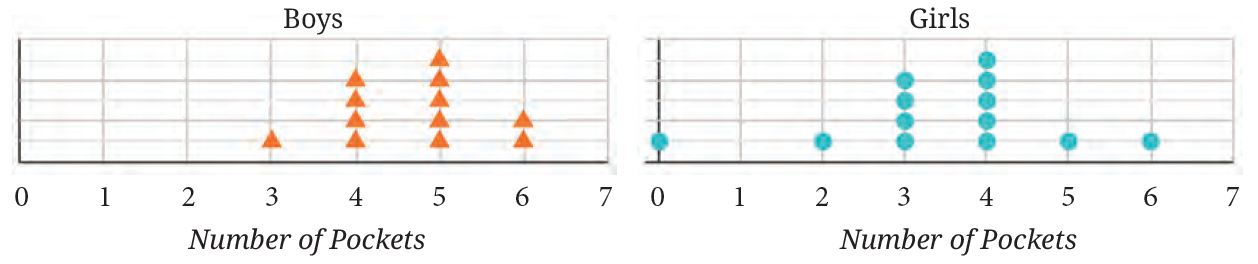
Dot plots showing pocket distributions for boys and girls

Based on the dot plots, which of the following statements are true?

(a) The data varies more for the boys than for the girls.

(b) The median number of pockets for the boys is more than that for the girls.

(c) The mean number of pockets for the girls is more than that for the boys.

(d) The maximum number of pockets for boys is greater than that for the girls.

Answer:

Analysis:

Boys' Data: $3, 4, 4, 4, 4, 5, 5, 5, 5, 5, 6, 6$ (Total $12$ students)

Girls' Data: $0, 2, 3, 3, 3, 3, 4, 4, 4, 4, 4, 5, 6$ (Total $13$ students)


Evaluating Statements:

(a) False: The girls' data ranges from $0$ to $6$ (variation $= 6$), while boys' data ranges from $3$ to $6$ (variation $= 3$). Thus, girls' data varies more.

(b) True: The median for boys (average of $6^{th}$ and $7^{th}$ term) is $\frac{4+5}{2} = 4.5$. The median for girls ($7^{th}$ term) is $4$. Since $4.5 > 4$, the median for boys is more.

(c) False: By observation, the boys' dots are concentrated towards higher numbers ($4$ and $5$) compared to girls ($3$ and $4$). The boys' mean will be higher.

(d) False: Both groups have a maximum of $6$ pockets.


Conclusion: The correct statement is (b).

Question 2. The following table shows the points scored by each player in four games:

Player Game 1 Game 2 Game 3 Game 4
A 14 16 10 10
B 0 8 6 4
C 8 11 Did not play 13

Now answer the following questions:

(a) Find the average number of points scored per game by A.

(b) To find the mean number of points scored per game by C, would you divide the total points by $3$ or by $4$? Why? What about B?

(c) Who is the best performer?

Answer:

(a) Average of Player A:

Points scored by A = $14, 16, 10, 10$

$\text{Total points} = 14 + 16 + 10 + 10 = 50$

$\text{Mean for A} = \frac{50}{4} = 12.5$


(b) Mean calculation for C and B:

For Player C, we would divide the total points by $3$ because he played only $3$ games. The game he "did not play" is not counted as an observation.

For Player B, we would divide the total points by $4$ because he played all $4$ games. Scoring $0$ points in Game 1 is still a valid score for a played game.


(c) Identifying the Best Performer:

Mean of A = $12.5$

Mean of B = $\frac{0 + 8 + 6 + 4}{4} = \frac{18}{4} = 4.5$

Mean of C = $\frac{8 + 11 + 13}{3} = \frac{32}{3} \approx 10.67$

Since $12.5 > 10.67 > 4.5$, Player A is the best performer.

Question 3. The marks (out of $100$) obtained by a group of students in a General Knowledge quiz are $85, 76, 90, 85, 39, 48, 56, 95, 81$ and $75$. Another group’s scores in the same quiz are $68, 59, 73, 86, 47, 79, 90, 93$ and $86$. Compare and describe both the groups performance using, mean and median.

Answer:

Group 1 Analysis:

Scores: $85, 76, 90, 85, 39, 48, 56, 95, 81, 75$ ($10$ students)

$\text{Mean}_1 = \frac{85+76+90+85+39+48+56+95+81+75}{10} = \frac{730}{10} = 73$

Sorted: $39, 48, 56, 75, 76, 81, 85, 85, 90, 95$. Median is between $5^{th}$ and $6^{th}$ term: $\frac{76+81}{2} = 78.5$


Group 2 Analysis:

Scores: $68, 59, 73, 86, 47, 79, 90, 93, 86$ ($9$ students)

$\text{Mean}_2 = \frac{68+59+73+86+47+79+90+93+86}{9} = \frac{681}{9} \approx 75.67$

Sorted: $47, 59, 68, 73, 79, 86, 86, 90, 93$. Median ($5^{th}$ term) = $79$


Comparison:

Group 2 performed better on average (Mean $= 75.67$ vs $73$) and also had a higher median score ($79$ vs $78.5$). Group 1's performance was pulled down by the very low score of $39$.

Question 4. Consider this data collected from a survey of a colony.

Favourite Sport Cricket Basket Ball Swimming Hockey Athletics
Watching 1240 470 510 430 250
Participating 620 320 320 250 105

Choose an appropriate scale and draw a double-bar graph. Write down your observations.

Answer:

Scale: Let $1 \text{ unit length} = 100 \text{ people}$.


Observations:

1. Cricket is the most popular sport both for watching ($1240$) and participating ($620$).

2. Athletics is the least popular sport in this colony.

3. In every category, the number of people who enjoy watching the sport is significantly higher than the number of people who participate in it.

4. Swimming and Basketball have an equal number of participants ($320$).


Double bar graph of sports survey

Question 5. Consider a group of $17$ students with the following heights (in cm): $106, 110, 123, $$ 125, 117, 120, 112, 115, $$ 110, 120, 115, $$ 102, 115, $$ 115, 109, $$ 115, $$ 101$. The sports teacher wants to divide the class into two groups so that each group has an equal number of students: one group has students with height less than a particular height and the other group has students with heights greater than the particular height. Suggest a way to do this. Can you guess the age of these students based on the tabular data in the ‘Telling Tall Tales’ section?

Answer:

Given:

Heights of $17$ students in cm: $106, 110, 123, 125, 117, 120, 112, 115, 110, $$ 120, 115, 102, 115, 115, 109, 115, 101$

Number of students ($n$) = $17$


To Find:

1. A particular height (Median) to divide the class into two equal groups.

2. The heights of students in each group.

3. Guess the age of the students based on Indian growth data.


Solution:

To divide the students into two equal groups, we must first arrange the heights in ascending order to identify the central value or the Median.

Step 1: Ascending Order

$101, 102, 106, 109, 110, 110, 112, 115, 115, 115, 115, 115, 117, 120, 120, $$ 123, 125$

Step 2: Identifying the Median

Since the number of observations ($n = 17$) is odd, the median is the $\left(\frac{n+1}{2}\right)^{th}$ term.

$\text{Median Position} = \frac{17 + 1}{2} = 9^{th} \text{ position}$

Counting the $9^{th}$ term in our ordered list:

$\text{Median height} = 115\text{ cm}$

[The threshold height]


Group Formation:

With $17$ students, the teacher can form two groups of $8$ students each, using the $9^{th}$ student (the median) as the reference point.

Group 1: Students with height $\leq$ Median ($115\text{ cm}$)

Student No. Height (cm)
1101
2102
3106
4109
5110
6110
7112
8115
9115

Group 2: Students with height $\geq$ Median ($115\text{ cm}$)

Student No. Height (cm)
1115
2115
3115
4117
5120
6120
7123
8125

Age Estimation:

A height range of $101\text{ cm}$ to $125\text{ cm}$ with a median of $115\text{ cm}$ corresponds to children in the age group of $6$ to $7$ years.

This suggests that these students are likely in Class 1 or Class 2.

Question 6. Describe the mean and median of heights of your class. You can visualise the heights on a dot plot.

Answer:

This is an activity-based question. To describe the mean and median, you must first collect the heights of all students in your class (e.g., $30$ students).


Procedure:

1. Mean: Add the heights of all students and divide the sum by the total number of students. The mean represents the average height of the class.

2. Median: Arrange the heights in ascending order. The height of the middle student is the median. It represents the height such that half the class is shorter and half the class is taller than this value.


Sample Observation:

If a class has heights like $130, 132, 135, 135, 138, 140, 142 \text{ cm}$, the mean would be the average of these, and the median would be the middle value ($135 \text{ cm}$).

Dot Plot: You can create a dot plot by drawing a number line and placing a dot for each student's height above the corresponding number. This helps visualise if the heights are clustered together or spread out.

Question 7. There are two 7th grade sections at a school. Each section has $15$ boys and $15$ girls. In one section, the mean height of students is $154.2\text{ cm}$. From this information, what must be true about the mean height of students in the other section?

(a) The mean height of students in the other section is $154.2\text{ cm}$.

(b) The mean height of students in the other section is less than $154.2\text{ cm}$.

(c) The mean height of students in the other section is more than $154.2\text{ cm}$.

(d) The mean height of students in the other section cannot be determined.

Answer:

Given:

Section A: Total students = $30$ ($15$ boys and $15$ girls), Mean height = $154.2 \text{ cm}$.

Section B: Total students = $30$ ($15$ boys and $15$ girls).


Solution:

The mean height of a group depends entirely on the specific heights of the individuals within that group. Knowing the average height of one section does not provide any mathematical data about the heights of students in a different section.

Students in Section B could be taller, shorter, or of the same average height as Section A, but there is no rule stating they must be the same.


Therefore, the correct option is (d) The mean height of students in the other section cannot be determined.

Question 8. Standing tall in the storm.
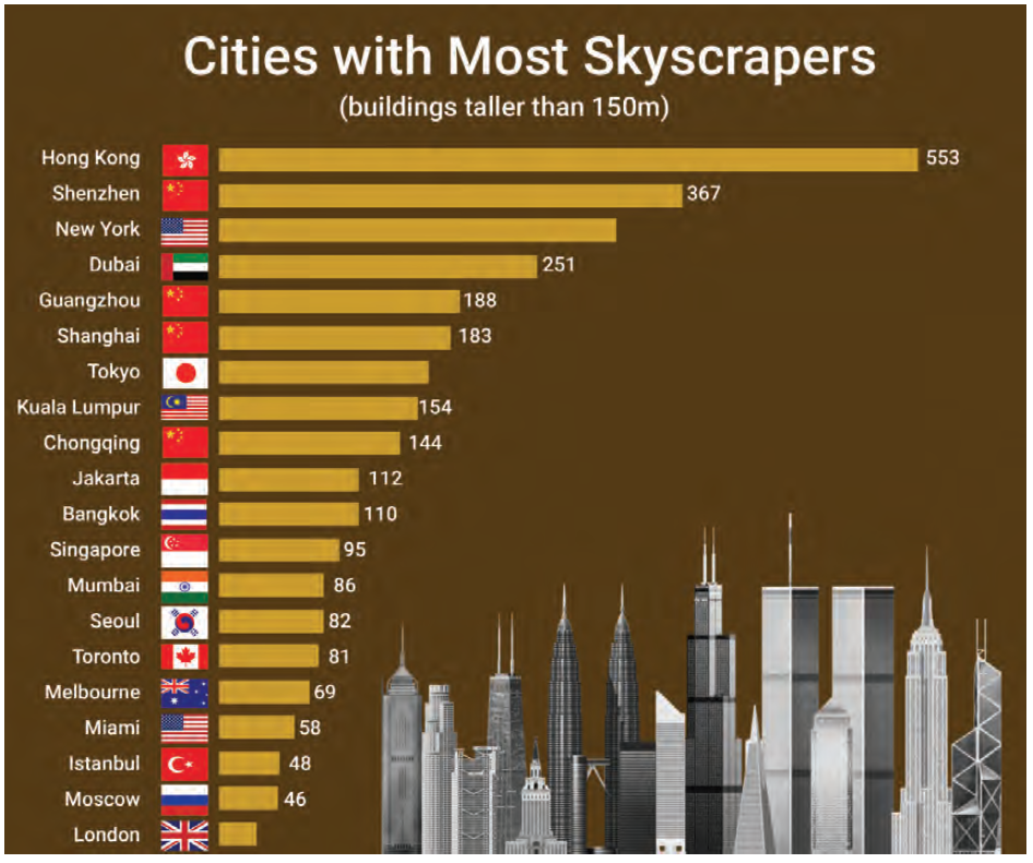
Infographic or bar graph showing number of skyscrapers in various cities including Mumbai, New York, Tokyo, and London

(a) Write estimated values for the number of skyscrapers in New York, Tokyo, and London.

(b) Are the following statements valid?

(i) Only $12$ cities have more skyscrapers than Mumbai.

(ii) Only $7$ cities have fewer skyscrapers than Mumbai.

(iii) The tallest building in the world is in Hong Kong.

Answer:

Given:

An infographic bar graph showing the number of skyscrapers (buildings taller than $150\text{ m}$) in various global cities. The values for some cities are provided numerically (e.g., Hong Kong: $553$, Shenzhen: $367$, Dubai: $251$, Mumbai: $86$).


To Find:

1. Estimated number of skyscrapers for New York, Tokyo, and London.

2. Validity of statements regarding Mumbai's rank and the location of the world's tallest building.


Solution:

(a) Estimating values based on the bar lengths:

We can estimate the values by comparing the lengths of the bars for the requested cities with the lengths of the bars for which values are already provided.

New York: The bar for New York is between Shenzhen ($367$) and Dubai ($251$). Visually, it is roughly in the middle but slightly closer to the $300$ mark.
Estimated Value $\approx 300$

Tokyo: The bar for Tokyo is between Shanghai ($183$) and Kuala Lumpur ($154$).
Estimated Value $\approx 165$

London: London has the shortest bar in the list, positioned below Moscow ($46$).
Estimated Value $\approx 30$


(b) Evaluating the statements:

(i) Only $12$ cities have more skyscrapers than Mumbai.

By counting the cities listed above Mumbai in the chart: (1) Hong Kong, (2) Shenzhen, (3) New York, (4) Dubai, (5) Guangzhou, (6) Shanghai, (7) Tokyo, (8) Kuala Lumpur, (9) Chongqing, (10) Jakarta, (11) Bangkok, and (12) Singapore.

There are exactly $12$ cities with more skyscrapers than Mumbai according to this list.

Statement (i) is Valid.


(ii) Only $7$ cities have fewer skyscrapers than Mumbai.

By counting the cities listed below Mumbai in the chart: (1) Seoul, (2) Toronto, (3) Melbourne, (4) Miami, (5) Istanbul, (6) Moscow, and (7) London.

There are exactly $7$ cities with fewer skyscrapers than Mumbai according to this list.

Statement (ii) is Valid.


(iii) The tallest building in the world is in Hong Kong.

The graph shows the number of skyscrapers (count) in each city, not the height of individual buildings. While Hong Kong has the highest count of skyscrapers ($553$), this does not mean it has the single tallest building in the world (the tallest building, Burj Khalifa, is in Dubai).

Statement (iii) is Invalid.

Question 9. Estimate and then measure the objects listed in the following table. Draw a double bar graph based on the data. How accurate were your estimates? Find the average difference between the estimated and measured values.

Object Estimate (in cm) Measure (in cm) Positive Difference
Length of a pen
Length of an eraser
Length of your palm
Length of your geometry box
Length of your math notebook

Answer:

Given:

A list of common stationery and personal objects to be estimated and then measured using a ruler or measuring tape.


To Find/To Do:

1. Record estimated and actual measured values for each object.

2. Calculate the Positive Difference for each observation.

3. Represent the data using a Double Bar Graph.

4. Calculate the Average Difference to check accuracy.


Solution:

Step 1: Data Collection

The student should first look at the object and write down an Estimate. After that, use a ruler to find the actual Measure. The Positive Difference is the absolute value of the subtraction between the two.

Object Estimate (in cm) Measure (in cm) Positive Difference
Length of a pen (e.g., $15$) (e.g., $14$) (e.g., $1$)
Length of an eraser __________ __________ __________
Length of your palm __________ __________ __________
Length of your geometry box __________ __________ __________
Length of your math notebook __________ __________ __________

Step 2: Calculating Positive Difference

For each object, use the following formula:

$\text{Difference} = |\text{Estimated Value} - \text{Measured Value}|$

Step 3: Calculating Average Difference

To find how accurate the estimates were on average, sum all the values in the "Positive Difference" column and divide by the number of objects ($5$).

$\text{Average Difference} = \frac{\text{Sum of all Positive Differences}}{5}$

A smaller average difference indicates higher accuracy in estimation.


Step 4: Visualisation (Double Bar Graph)

To draw the double bar graph, follow these steps:

1. Draw the Horizontal Axis ($x$-axis) and label it "Objects".

2. Draw the Vertical Axis ($y$-axis) and label it "Length (in cm)". Choose an appropriate scale (e.g., $1\text{ cm} = 5\text{ cm}$ on the graph).

3. For each object, draw two bars side-by-side: one representing the Estimate and the other representing the Measure.

4. Use different colours or patterns to distinguish between the Estimated and Measured bars and provide a Legend/Key.


Final Observations:

The student should conclude whether they tend to overestimate (Estimate > Measure) or underestimate (Measure > Estimate) based on the visual height of the bars in the graph.

Question 10. Aditi likes solving puzzles. She recently started attempting the ‘Easy’ level Sudoku puzzles. The time she took (in seconds) to solve these puzzles are — $410, 400, 370, 340, 360, 400, 320, 330, 310, 320, 290, 380, $$ 280, 270, $$ 230, 220, 240$. The first nine values correspond to Week 1 and the rest to Week 2.

(a) Construct a dot plot below showing the data for both weeks.

(b) Describe the mean, median, and any observations you may have about the data.

Dot plot scale for Sudoku solving times

Answer:

Given:

Week 1 data ($9$ values): $410, 400, 370, 340, 360, 400, 320, 330, 310$

Week 2 data ($8$ values): $320, 290, 380, 280, 270, 230, 220, 240$


(a) Dot Plot Construction:

To construct the dot plot, we place a blue triangle for Week 1 values and a red circle for Week 2 values on the provided time scale (from $200$ to $420$ seconds).

Completed dot plot for Week 1 and Week 2 Sudoku times

(b) Mean and Median Calculation:

For Week 1:

$\text{Sum} = 410 + 400 + 370 + 340 + 360 + 400 + 320 + 330 + 310 $$ = 3240$

$\text{Mean}_{\text{W1}} = \frac{3240}{9} = 360 \text{ seconds}$

Sorted data: $310, 320, 330, 340, \mathbf{360}, 370, 400, 400, 410$

$\text{Median}_{\text{W1}} = 360 \text{ seconds}$


For Week 2:

$\text{Sum} = 320 + 290 + 380 + 280 + 270 + 230 + 220 + 240 = 2230$

$\text{Mean}_{\text{W2}} = \frac{2230}{8} = 278.75 \text{ seconds}$

Sorted data: $220, 230, 240, 270, 280, 290, 320, 380$

$\text{Median}_{\text{W2}} = \frac{270 + 280}{2} = 275 \text{ seconds}$


Observations:

1. The average time in Week 2 ($278.75 \text{ s}$) is significantly lower than in Week 1 ($360 \text{ s}$), indicating that Aditi's speed has improved as she practiced.

2. The median also dropped from $360 \text{ s}$ to $275 \text{ s}$.

3. The Week 2 data is more spread out compared to the cluster in Week 1, but most values are shifted towards the faster (left) side of the scale.

Question 11. Individual Project: Pick at least one of the following:

(a) How Long is a Sentence? Pick any two textbooks from different subjects. Choose any page with a lot of text from each book.

(i) Use a dot plot to describe how many words the sentences have on each page.

(ii) Compare the data of both the pages using mean and median.

(b) What is in a Name? Write down the names of all of your classmates. The following are some interesting things you can do with this data!

(i) Find the mean and median name length (number of letters in a name).

(ii) Visualise the data and describe its variability and central tendency.

(iii) Which starting letters are more popular? Which are less popular?

(iv) What is the median starting letter? What does this say about the number of names starting with the letters A – M and N – Z?

(v) Plot a double-bar graph showing the number of boys’ names and girls’ names that: start and end with vowels, start with vowels and end with consonants, start with consonants and end with vowels, start and end with consonants.

Answer:

Note: These projects are designed for students to collect their own data. Below is the methodology and step-by-step guide on how to perform the analysis and present the findings.


Project (a): How Long is a Sentence?

Step 1: Data Collection

Pick two different textbooks (e.g., English Literature and Science). Select one page from each and count the number of words in at least $10$ to $15$ consecutive sentences. Record your data in a table:

Sentence No. Words in Book 1 (e.g., English) Words in Book 2 (e.g., Science)
1____________________
2____________________
...____________________

Step 2: Visualisation (Dot Plot)

For each book, draw a horizontal line with numbers representing the word counts. Place a dot ($\bullet$) for each sentence above its corresponding word count. If two sentences have the same number of words, stack the dots vertically.

Step 3: Statistical Analysis

Calculate the Mean and Median for both sets of data.

$\text{Mean} = \frac{\text{Sum of all word counts}}{\text{Number of sentences}}$

For the Median, arrange the word counts in ascending order and find the middle value. If the number of sentences is even, find the average of the two middle values.


Project (b): What is in a Name?

Step 1: Listing and Counting

List the names of all your classmates. Count the number of letters in each name (excluding surnames if needed for simplicity).

Name Number of Letters Starting Letter Ends with (Vowel/Consonant)
(e.g.) Aarav5AVowel
(e.g.) Ishan5IConsonant

Step 2: Central Tendency (Mean and Median)

1. Mean Length: Add the number of letters of all names and divide by the total number of students.

2. Median Length: Arrange the letter counts in ascending order and identify the middle value.

Step 3: Alphabetical Analysis

1. Popularity: Use tally marks to find the frequency of each starting letter. The letter with the highest frequency is the Mode (most popular).

2. Median Starting Letter: Arrange the starting letters of all names in alphabetical order (A to Z). Find the middle letter in this list. If it falls between $A$ and $M$, most names start with letters from the first half of the alphabet.

Step 4: Categorisation and Double-Bar Graph

Classify every student into one of the four categories mentioned in the question (Vowel-Vowel, Vowel-Consonant, etc.). Count the number of Boys and Girls in each category.

Category Number of Boys Number of Girls
Start Vowel / End Vowel____________________
Start Vowel / End Consonant____________________
Start Consonant / End Vowel____________________
Start Consonant / End Consonant____________________

Draw a double-bar graph with these four categories on the x-axis and the count of students on the y-axis.


Final Observations:

1. Variability: Mention the Range (Difference between the longest and shortest name/sentence).

2. Interpretation: Describe if the data is "spread out" or "clustered" around the mean/median.

Question 12. Individual project (long term): This requires collecting data over 2 weeks or more.

In and Out: Track how many times you step out of your house in a day. Do this for a month.

(i) Describe the variability and central tendency of this data. Make a dot plot.

(ii) Do you find anything interesting about this data? Share your observations.

(iii) You can ask any of your family members or friends to do this as well.

Answer:

To complete this project, follow these steps:

1. Data Collection: Keep a small diary near your door and record every time you exit. Do this for $30$ days.

2. Calculation: At the end of the month, add up all the counts and divide by $30$ to find your daily mean. Arrange the $30$ values in order to find the median.

3. Variability: Observe the difference between your highest count (maybe on a weekend) and your lowest count (maybe on a holiday or rainy day). This is the range.


Visualisation: Draw a number line from $0$ to your maximum count and place a dot for every day you stepped out that many times.

Question 13. Small-group project: Pick at least one of the following. Make groups of $8$ to $10$. Collect data individually as needed. Put together everyone’s data and do the appropriate analysis and visualisation.

(a) Our heights vs. our family’s heights: Collect the heights of your family members.

(i) Make a dot plot showing heights of just your family members. Describe its variability and central tendency.

(ii) Make a double-bar graph showing each student’s height next to their family’s mean height.

(iii) Look at everyone’s data and share your observations.

(b) Estimating time: Check the time and close your eyes. Open them when you think $1$ minute has passed (no counting). Note down after how many seconds you opened your eyes. Collect this data for yourself and for your family members. Repeat this activity to estimate $3$ minutes.

(i) Make two dot plots (for $1$ minute and $3$ minutes) showing estimates of just your family members.

(ii) Mark these on the respective dot plots. Describe its variability and central tendency.

(iii) Make a double bar graph showing each family’s mean $1$ minute estimate and mean $3$ minute estimate.

(iv) Look at everyone’s data and share your observations.

Answer:

Note: This project is to be performed by the student based on actual data collection. Below is the step-by-step framework and methodology to complete this project successfully.


Project (a): Our heights vs. our family’s heights

Step 1: Data Collection

Collect the heights of yourself and at least four other family members (parents, siblings, etc.) in centimetres (cm). Use the table below to record your data:

Family Member Relationship Height (in cm)
Member 1Self__________
Member 2Father__________
Member 3Mother__________
Member 4____________________
Member 5____________________

Step 2: Analysis of Family Data

(i) Dot Plot: Draw a horizontal number line marked with height values. For every family member's height, place a dot ($\bullet$) above the corresponding value. If heights repeat, stack the dots vertically.

(ii) Central Tendency: Calculate the Mean height of your family.

$\text{Mean} = \frac{\text{Sum of all family heights}}{\text{Total number of members}}$

... (i)

(iii) Variability: Calculate the Range of the heights.

$\text{Range} = \text{Maximum height} - \text{Minimum height}$

... (ii)


Step 3: Group Collaboration and Visualisation

Combine your Mean Family Height with your group mates' data and represent it using a double-bar graph. On the x-axis, write student names. For each student, draw two bars: one for the Student's height and one for their Family's Mean height.


Project (b): Estimating Time

Step 1: Experiment and Recording

Perform the time estimation activity with your family members. Use a stopwatch to record the actual seconds elapsed when they think the time is up. Do not let them count or look at a clock.

Person 1 minute estimate (s) 3 minutes estimate (s)
Self____________________
Member 2____________________
Member 3____________________
Member 4____________________

Step 2: Analysis and Visualisation

(i) Dot Plots: Create two separate dot plots. One for $1$-minute estimates (Goal: $60\text{s}$) and one for $3$-minute estimates (Goal: $180\text{s}$).

(ii) Comparison: Calculate the Mean for both sets of estimates. Observe if the mean value is close to the actual goal ($60\text{s}$ or $180\text{s}$).

(iii) Double-Bar Graph: Plot a graph showing the Mean $1$-minute estimate versus the Mean $3$-minute estimate for every family in your group.


Final Step: Group Observations

Discuss the following within your group:

1. For Heights: Is there a strong correlation between the student's height and their family's average height?

2. For Time: Does the variability increase when the time duration is longer ($3$ minutes) compared to $1$ minute? Do people generally under-estimate or over-estimate the time?
